← Back to Projects
Visual identity for Cuimo, a second-hand motorcycle marketplace connecting buyers and sellers across Spain.
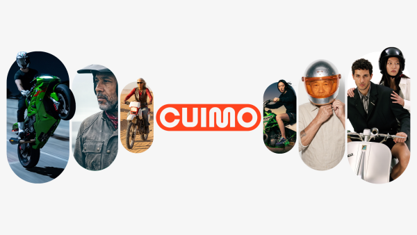
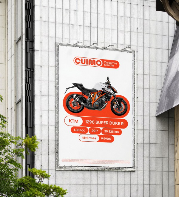
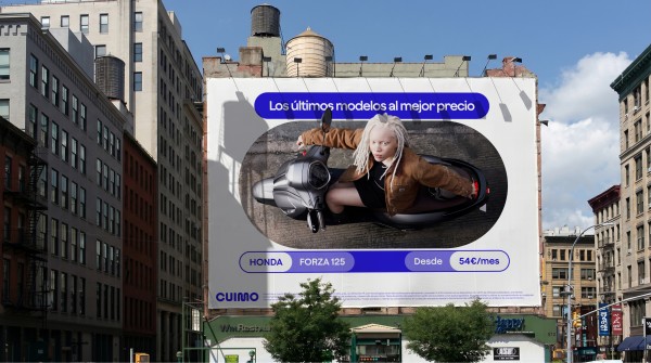
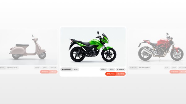
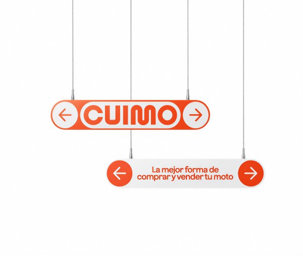
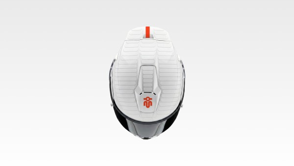
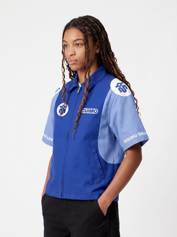
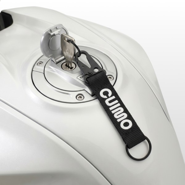
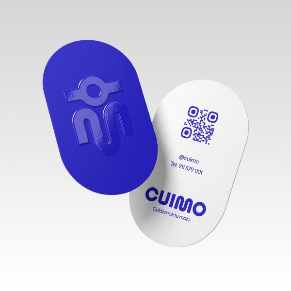
The brand starts from a single gesture: a capsule formed between two circles, representing the union between buyer and seller, a shape that also exists in every motorbike. That capsule became the base ingredient for the whole system: logotype, brand resources, icons for each motorcycle category, signage and merch.
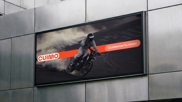
The challenge was building a brand that breathes motorcycle without the usual register of the motor world, masculine, cold and aggressive. Cuimo needed to feel close and reliable, speaking just as naturally to older and younger demographics, including those who never felt invited into that world. Because the starting point is so simple, the identity adapts across any format and stays recognisable.
Cuimo
Cuimo
2025
The brand starts from a single gesture: a capsule formed between two circles, representing the union between buyer and seller, a shape that also exists in every motorbike. That capsule became the base ingredient for the whole system: logotype, brand resources, icons for each motorcycle category, signage and merch.
The challenge was building a brand that breathes motorcycle without the usual register of the motor world, masculine, cold and aggressive. Cuimo needed to feel close and reliable, speaking just as naturally to older and younger demographics, including those who never felt invited into that world. Because the starting point is so simple, the identity adapts across any format and stays recognisable.

- Related Projects